This is just a post for fun to analyze some UI interaction patterns implemented in some of the applications I use. Netflix has a specific bias for various reasons. Just have fun reading it and I hope you find it to be good information! ????
Media Browser Pattern
What?
Hmm... What is the Media Browser design pattern?
We can imagine some application with a large view. In this case, the easiest visualization would be a window, or a browser page. This view which displays a "media browser", usually consists of a grid-based layout of items as a list. Each item can be a box which represents a file, video, document, etc. When a user interacts with one of the items, they can find more information about the associated content represented by this box.
In a file system, the file explorer is the interface which allows a user to navigate through the available media. It is an implementation of the media browser pattern. The files are visually represented as icons. These icons, are essentially the boxes as mentioned before.
In order to keep the language simple, I'm going to use the term "media" very loosely. I'll be using it to refer to not just multimedia entities, but just a generic description of a file, document, video, etc.
Finding Information
The implementation of the media browser in a file explorer will usually consist of the list of the media being rendered and the mechanisms to find more information, preview, or consume the content.
One of the goals of the media browser is to obtain information about the media quickly without extra interaction. When selecting an item, a user can find more information about it, or consume it. In this case for the file explorer application, a user can:
- Select the item and view the file metadata such as the filename, last access time, and file size.
- Select the item in another way to "consume" it. In this case, if it is a file, a program will run and open the file. Or, if the file is a program, it will execute.
For file explorers, the first scenario satisfies a lot of use cases where users just want to quickly move through a bunch of files to understand whether they are in the right track in choosing the correct file without having to perform additional actions to find more.
The second scenario where they can drill down further will usually be performed if the user finally encounters a potential file of interest but hasn't committed to opening it yet. Since usually consumption is quite expensive (for example, starting a new app), it allowing multiple levels of preview to allow a user to become confident in picking their needle from a haystack is a respectable interaction pattern.
Management
Media can be managed such as the ability to copy, delete and move them to different locations. These are functionality more closely related to fulfilling some sort of task. That's why media browsers are so prominent in applications such as video editors, as the media being imported (copied) can be used to build a timeline through drag and drop (moving).
Preview
Additionally, a media browser will always have some way to allow a user to preview the contents of the file. In the file explorer, a user can alternate between different views through a button which can display the media as a list of items represented as text, items preview thumbnails, or a small preview of the media being played if it is a video.
The Media Browser Within Netflix
You are an observant person, right? I am sure you are! If the description of a grid with media doesn't ring any sort of bells of any other app aside from a file explorer, then it will now!
A lot of streaming video content websites like to implement the media browser design. It is a well understood layout by a lot of users who want to go to a website to watch video at this point.
In my opinion, after viewing some of the competitors of Netflix, I think the implementation of media browser is absolutely fantastic.
Finding Information About Media
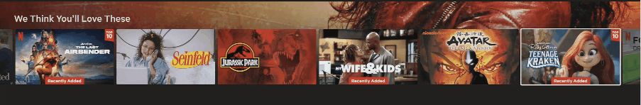
In the case of Netflix, the media browser pattern is clearly used and shown when a user browses to the home page after logging in to the appropriate profile.
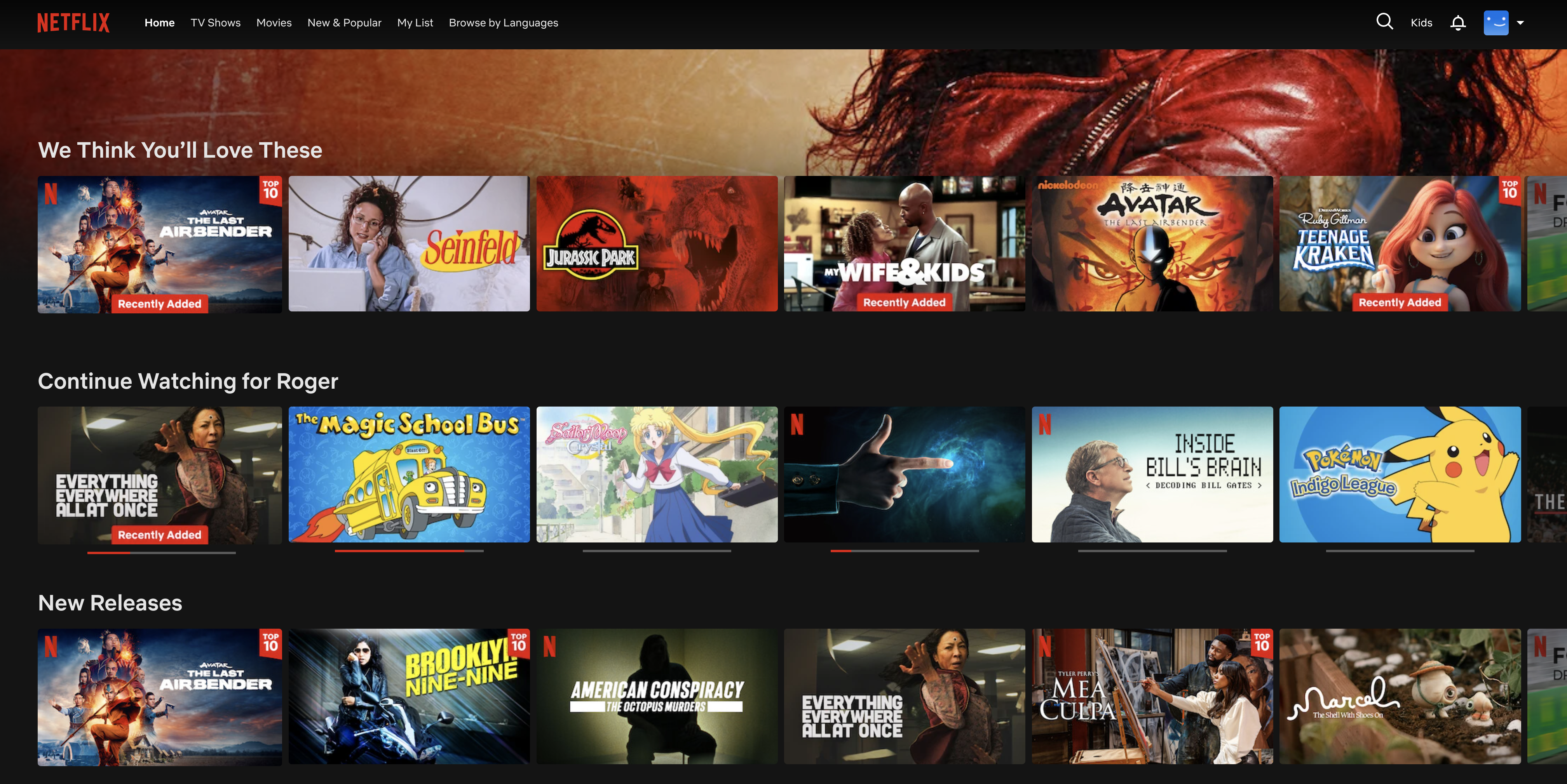
Notice how each title which can be played is an item itself. These titles are represented in box art form. The advantage of applications which use media such as images and video is that the box art itself can be a way to communicate details about the title already. Usually the title will have the title in words either in vertical or horizontal half of the image. These are very predictable placements which allows a user to quickly scan through what they want to watch.
An important detail to know for later is that for each title being rendered, the dimensions of the containing box is 311x175 on my computer. Or, we can say that gives us about 54,425 pixels of real estate. Again remember this number because we will soon understand how competent this pattern is implemented on the Netflix site.
Let's talk about finding information.
For each of the titles, a user can hover over the title to get a video preview of the title.
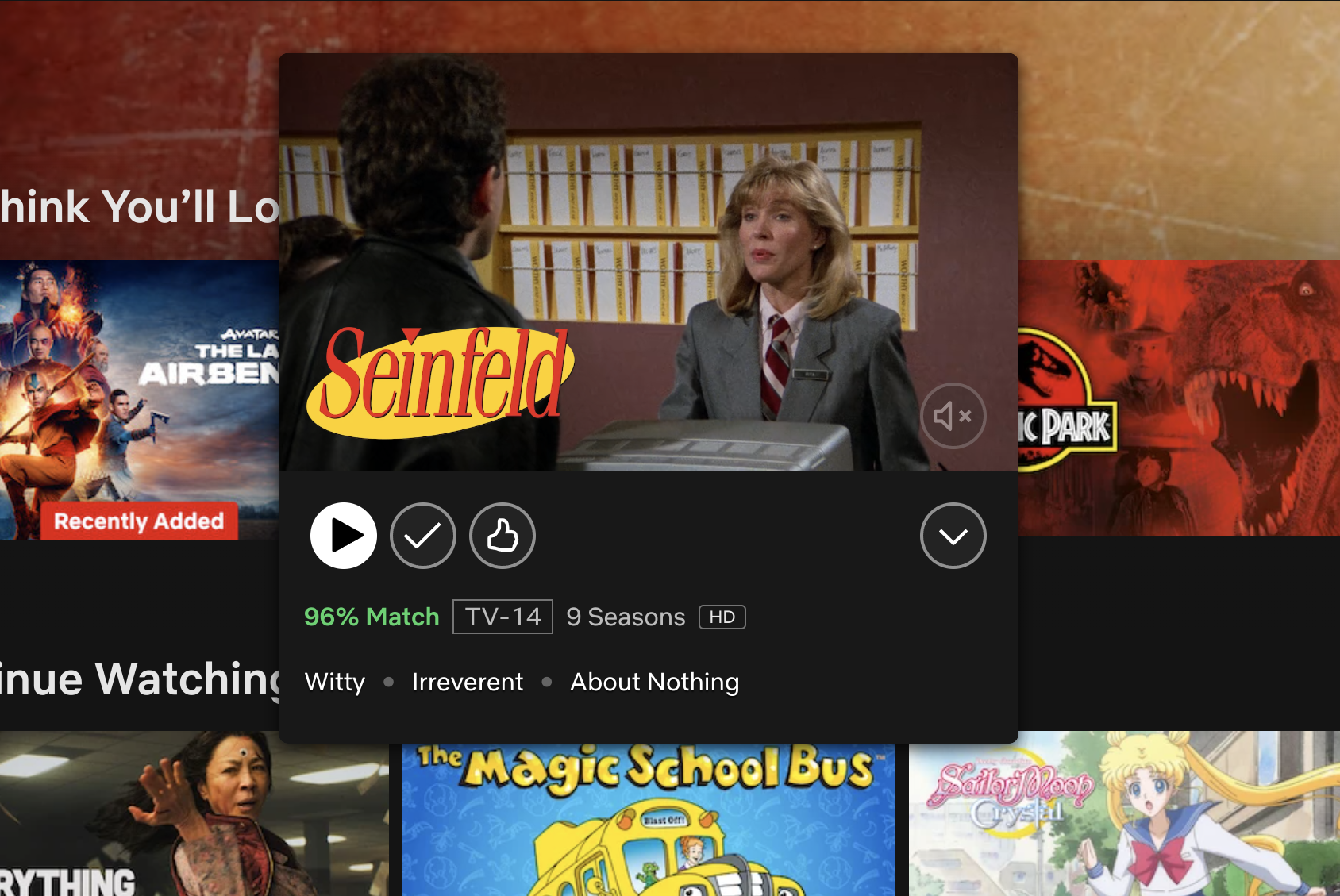
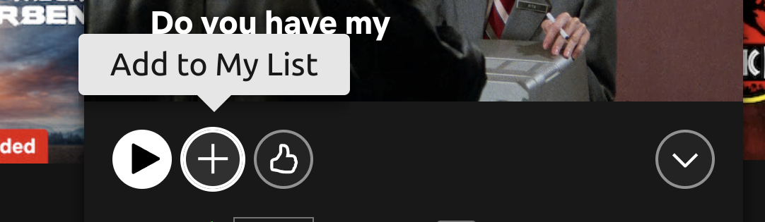
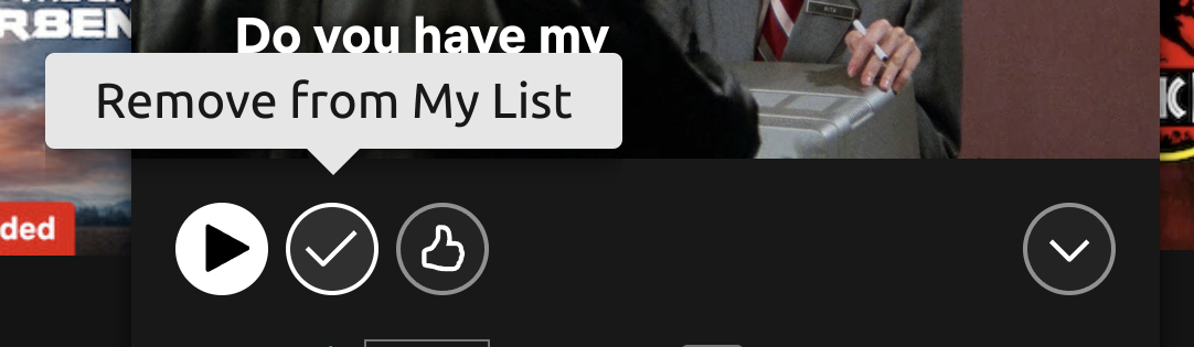
In this container in which the preview being played, more information about the title is displayed:
- A user will have the ability to "consume" the media by hitting the Play button. This will begin playing the video fullscreen in full.
- Add to the profile's list "My List" directly with the + button.
- View information about relevance, TV rating, number of seasons, and several categories describing the show.
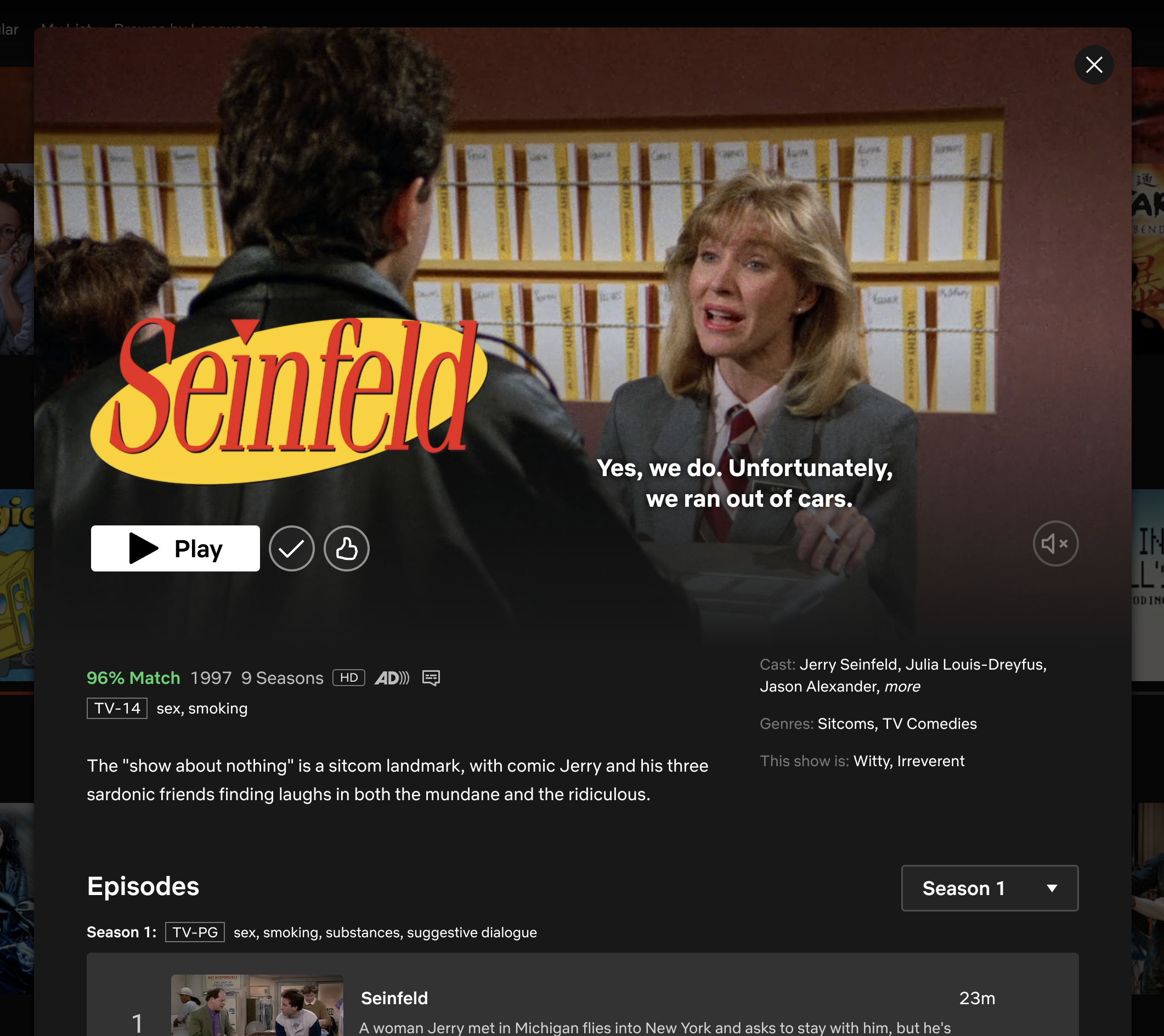
- Most important, the user is allowed expand to even more details about the title with a larger video player playing the preview, and more information presented such as the cast.
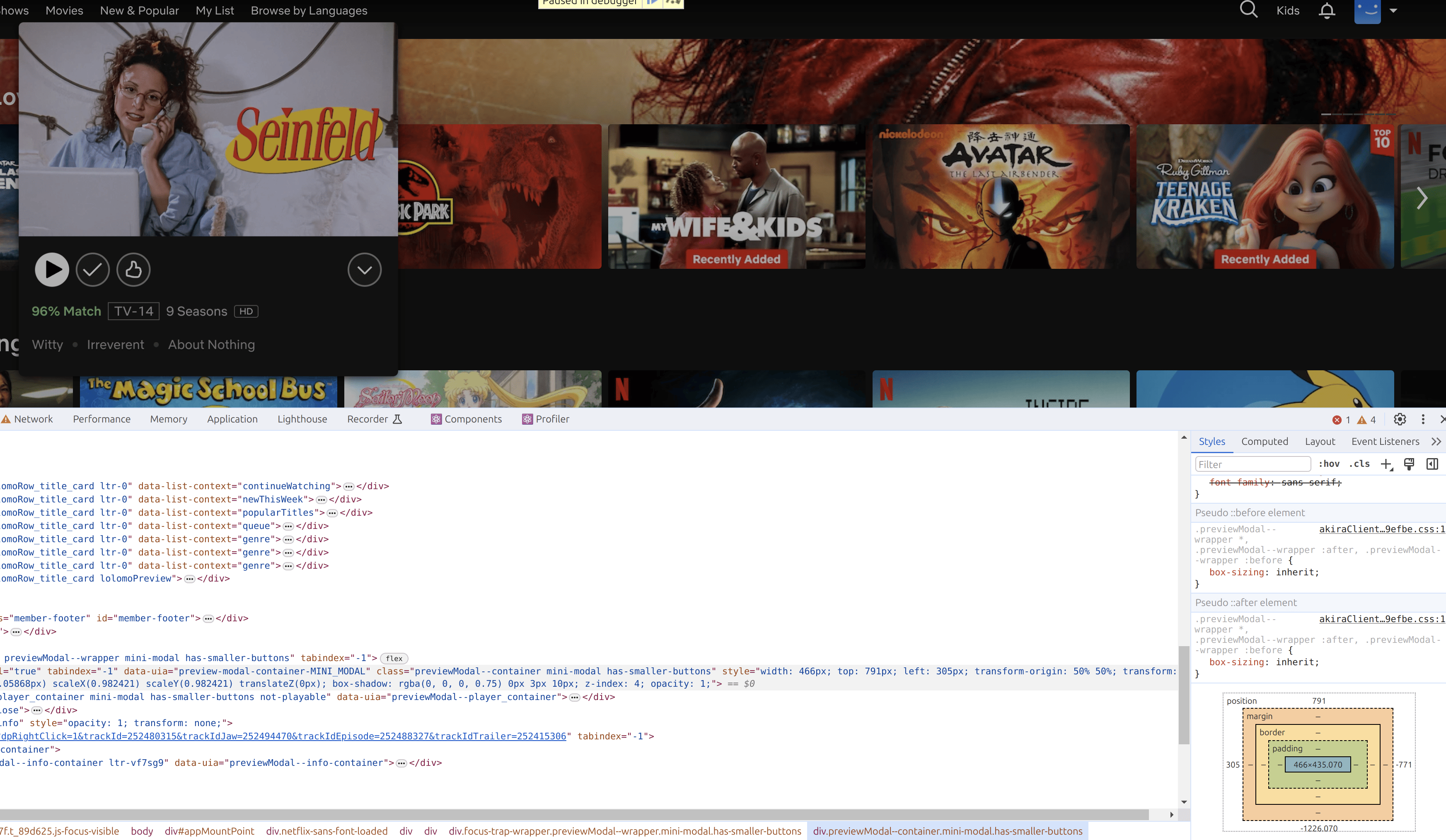
Okay so let's stick with the point about the action on selecting the title through hover or pause on the selection. When the title is expanded in its first level to display more information and preview of the video, the dimensions of the container of the expanded video preview increases to about 466x435. This is 202,710 pixels in area now. This translates to almost 3.72x increase in area, but it is deceptively small when looking at it in comparison to the unexpanded titles next to it.
This is a clever psychological trick and Netflix uses the new area well by packing in so much useful information about the title. It is more or less enough to judge whether a title is worth watching just by pausing on it slightly while doom scrolling on figuring out what to watch.
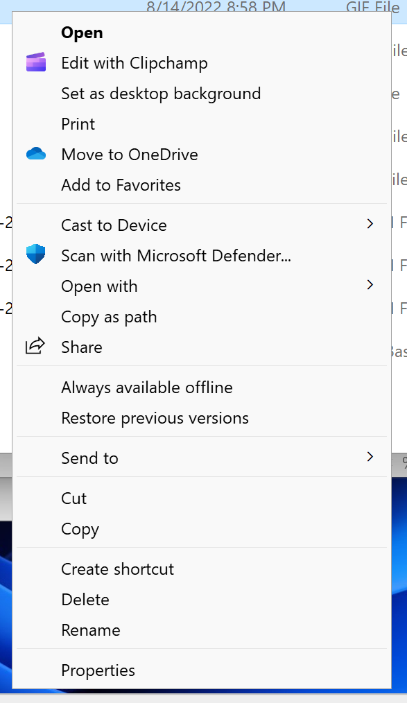
An analogous pattern here would be the "Properties" of a file in the file explorer, or by selecting a file.
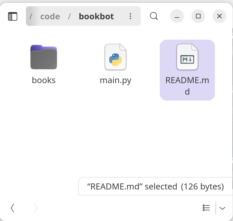
Notice on the bottom corner of my GNOME Files app, I get to see the file selected, along with the file size.
The fact that Netflix is able to provide so much information in a small area is remarkable and is a detail in design that may not seem impressive until the amount of communication of a single item without doing much work (just hovering) is realized.
The animation for when a user expands the title is also done in a tasteful manner as to draw the attention to the title.

Not committed on watching yet and need more information? Or perhaps you want to view a specific episode? Well, there is a second level to acquire more metadata about the video! The second level of the expanded form of a video shows more information.
In this state, the UI shows the same information as the title when in its first expanded form, but now this second level has more information such as cast information, genre and some description.
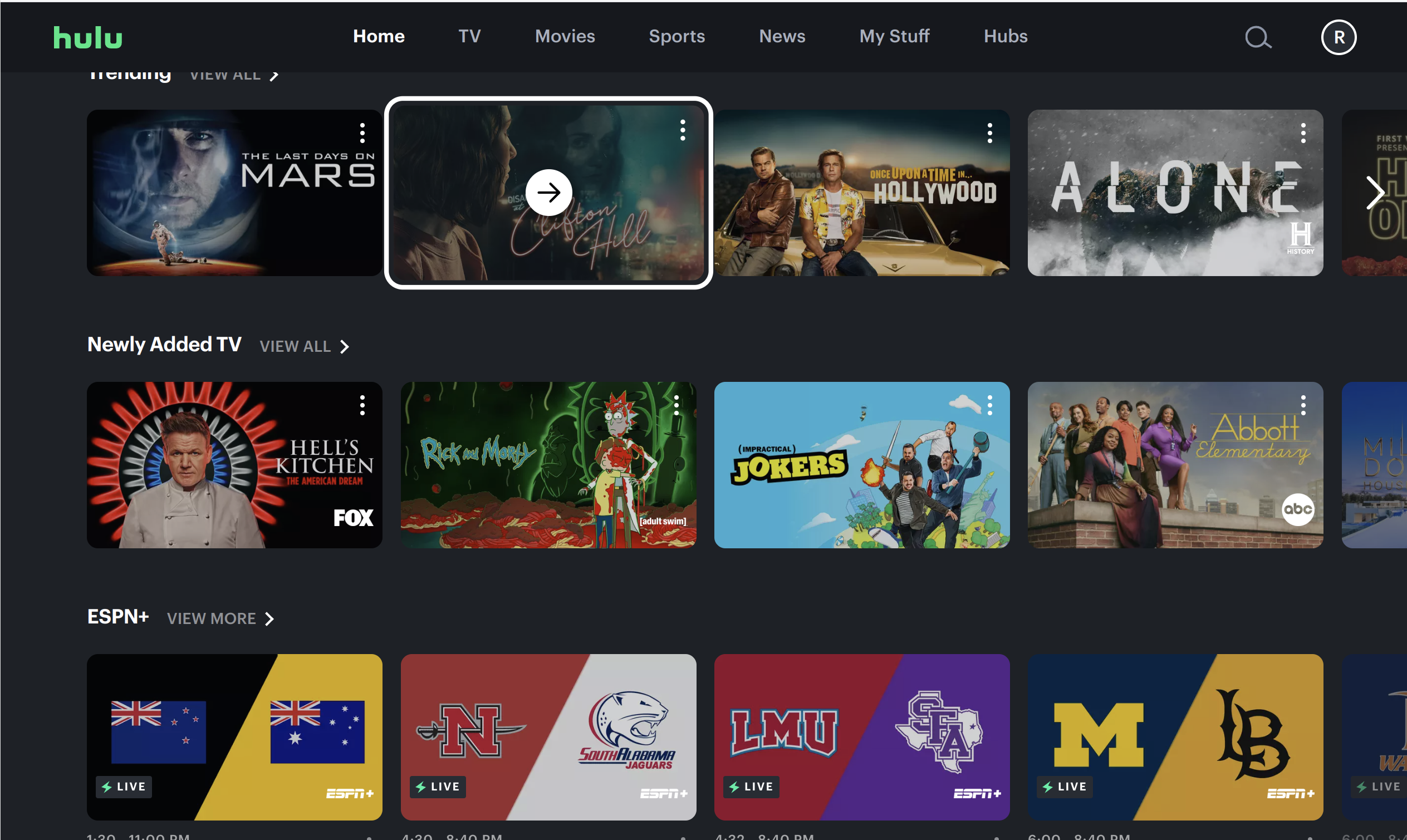
In a similar app, Hulu, we see that this pattern is not implemented. As a user, this makes it difficult to quickly view more details of a title, and makes it much more difficult to be productive in managing content to watch.
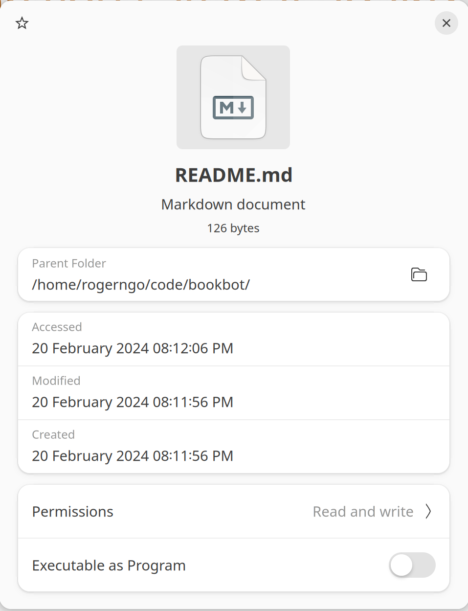
As a direct comparison with the file explorer example previously noted, this is the same as "right click" on the file and choosing "Properties". Here, you get much more information about the file. Again, you will see the same basic information as if you selected the file in the file explorer: the name and file size, but you will get things such as the file path, the last access time, and things like permissions.
In both cases of implementations of the media browser design by Netflix and a file explorer, in order to get an "expanded" preview of the media, the user has to perform a deliberate action to display it. For Netflix, clicking on the box art, or expanding, and for the file explorer, right clicking on the file and selecting "Properties". It seems like for Netflix, the fact it is very easy to get more information means that this behavior was not intended to be targeted for the "power user". In contrast with the file explorer, the many more steps to view more details about the file is more "power user"-like.
Browsing
An additional feature of the media browser is that a user is able to navigate through for more media. Typically, in the file explorer, a user can scroll through the viewport to find the specific file they are looking for.
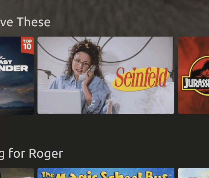
For Netflix, a user can click on the arrow buttons on each end of the strip serving as "previous page" and "next page" actions. This is a clear, and well understood pattern in cases where more information is available than what can actually be displayed in a constrained view. In addition to the left and right movement of media, the user can scroll up and down the page for more media categorized in different ways.
Managing Media
A media browser can choose to implement as much functionality as necessary to allow a user to fulfill a task in relation to the media type and service of the application.
For example, in the file explorer, a user can open, copy, delete and move files. They can create new files and folders. The variety of operations made available to the user in the file explorer makes sense as they want to manage their file system using a file explorer.
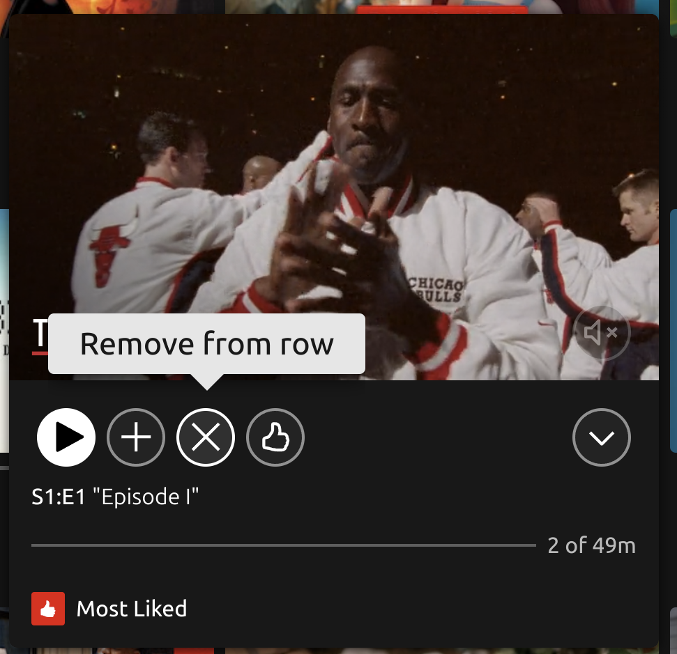
In Netflix, users can manage the titles to a certain extent. They can choose to save their title to their list, remove the title from a row, or like, not like, and love the title.
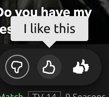
It is interesting in the feedback example, Netflix decides to save on real estate and use the same "expansion" pattern to render out more options for the feedback button. Again, the animation draws the eyes attention to the buttons. I would say the one criticism I would have is that there needs to be better contrast between the feedback controls which get rendered against the expanded title.
For those who are hard of sight, and need high contrast, this could be a problem.
If a user uses the "Remove from row" option enough, they can effectively curate their own hyper-customized Netflix experience. This is very useful for families where kids may have specific tastes and prefer routine as opposed to variety.
In summary, each individual action fulfills the purpose in allowing the user to curate their own collection of titles. While Netflix has a system of recommendations to solve discovery problems in finding new titles, the functionality in which Netflix provides to manage existing known titles is powerful if the user is wanting to create their own custom workflow in quickly navigating and consuming titles in which they will access more than once.
Conclusion
The media browser pattern is a very useful way to implement display of content which allows a user to find more information, manage and preview specific media. Given a lot of content on screen, implementing a media browser can help with reducing the chance of causing stress on the user with the overload of content.
Reducing the information load, and showing information as necessary when the user is interested allows them to fulfill their task quickly and reliably. In the case of streaming video apps like Netflix, the user doesn't have to focus on figuring out how to play a title, or whether the title is good for them. Instead, it is all passive and becomes second nature in simply pausing slightly to view more information and hitting the play button if desired.